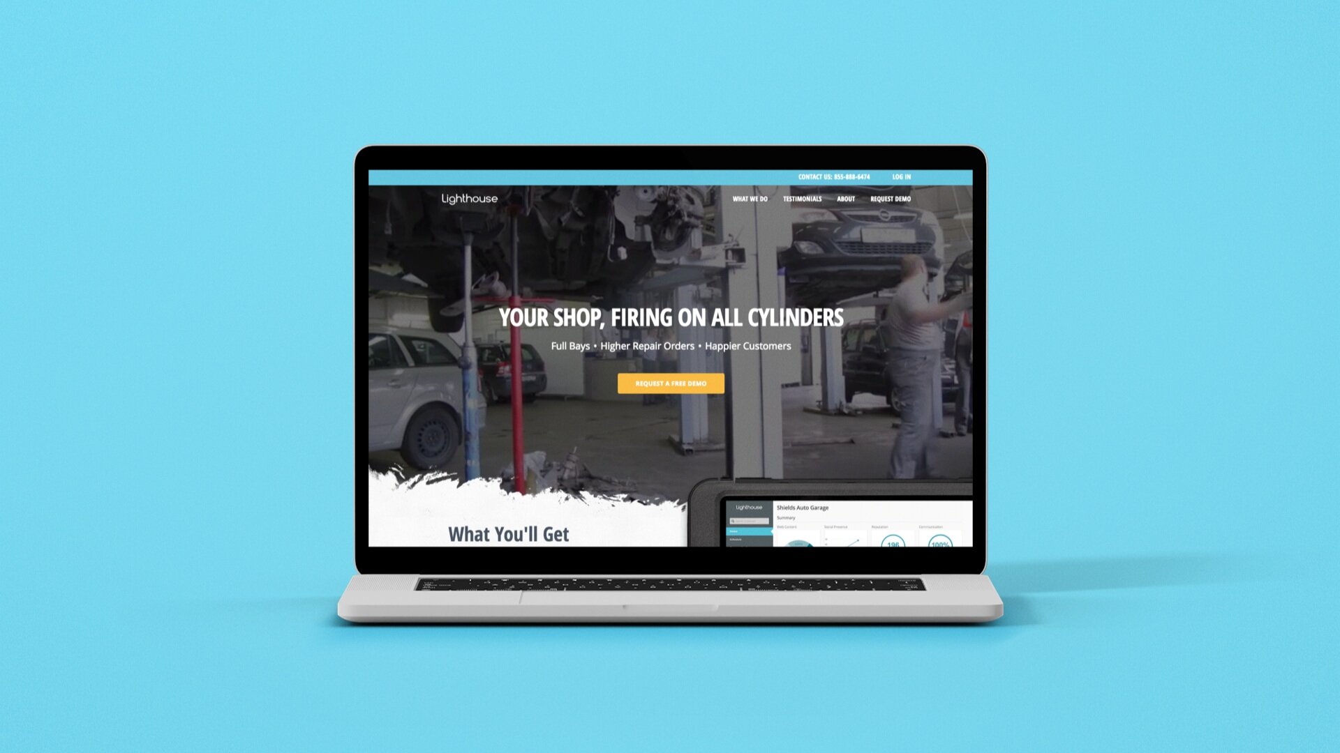
Lighthouse: Integrated, Dental, Auto, Field Services websites
Iteratively Redesigning All the Lighthouse Product Websites.
At Yodle, strategizing what to do with various brands and their visual identities was a key function of my role. One of the more challenging projects was how to quickly and iteratively revamp the Lighthouse product brands and create a seamless prospect journey amongst them.
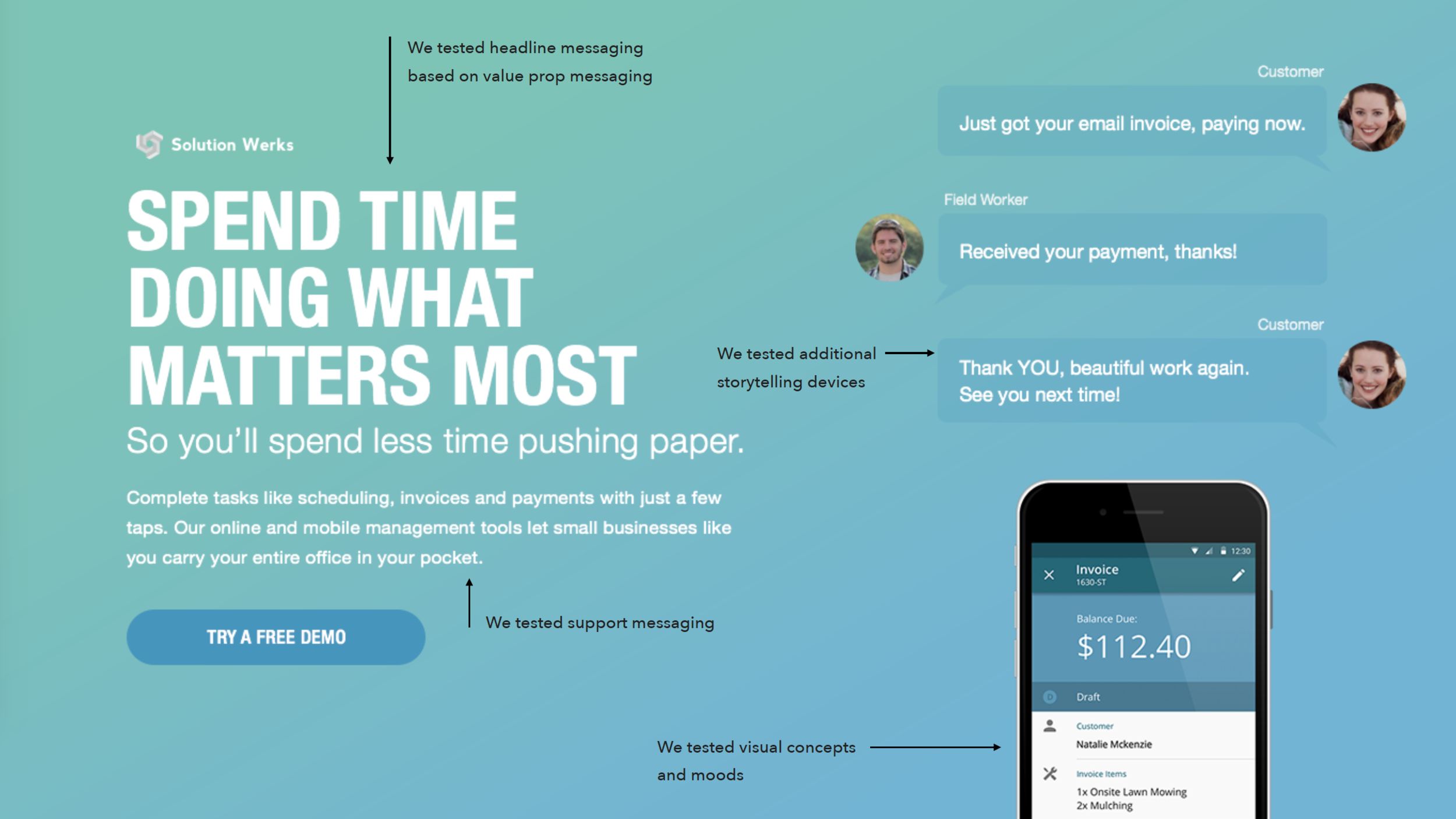
We began with talking to our customers and target audience by testing visuals and messaging for each individual site. This gave us clear insights in that we were underserving in treatment and information what prospects were looking for in a site to help them determine if they wanted a sales call/demo of the product.
Role: Creative Direction & Strategy
We tested various landing page options with multiple value propositions, tone of voice concepts and visual devices to find out what quickly moved prospects to the next part of the funnel.
High level takeaways from the research:
In our marketing communications there are two key things we need to achieve in order to quickly build a relationship:
1. We need to connect with our audience by speaking their language, quickly identifying with their pain points in running their business and focusing on their priority, delivering a positive experience with their customers.
2. Quickly show how our product intersects as the solution to their business, showcase a few key features and prove that it works.
Lighthouse Integrated Website
The objective of the integrated Lighthouse site was to build SEO continuity and was created as a portal for prospects to understand the company and select their product by industry (Automotive, Dental, Field Service, Chiropractic).
We kept the user experience and visuals simple so that a user could get to where they were going quickly. We optimized the language to be SEO friendly and straightforward.
Lighthouse Automotive Website
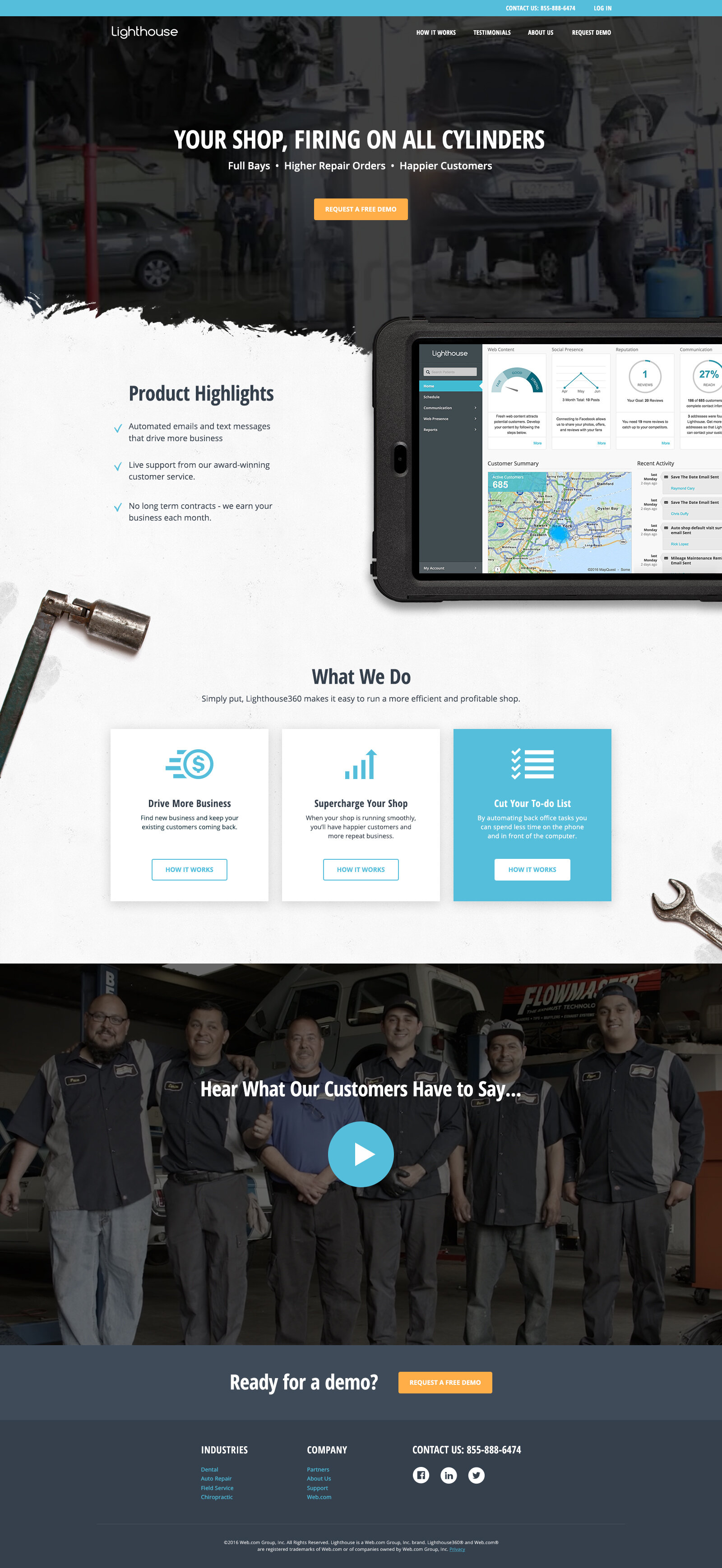
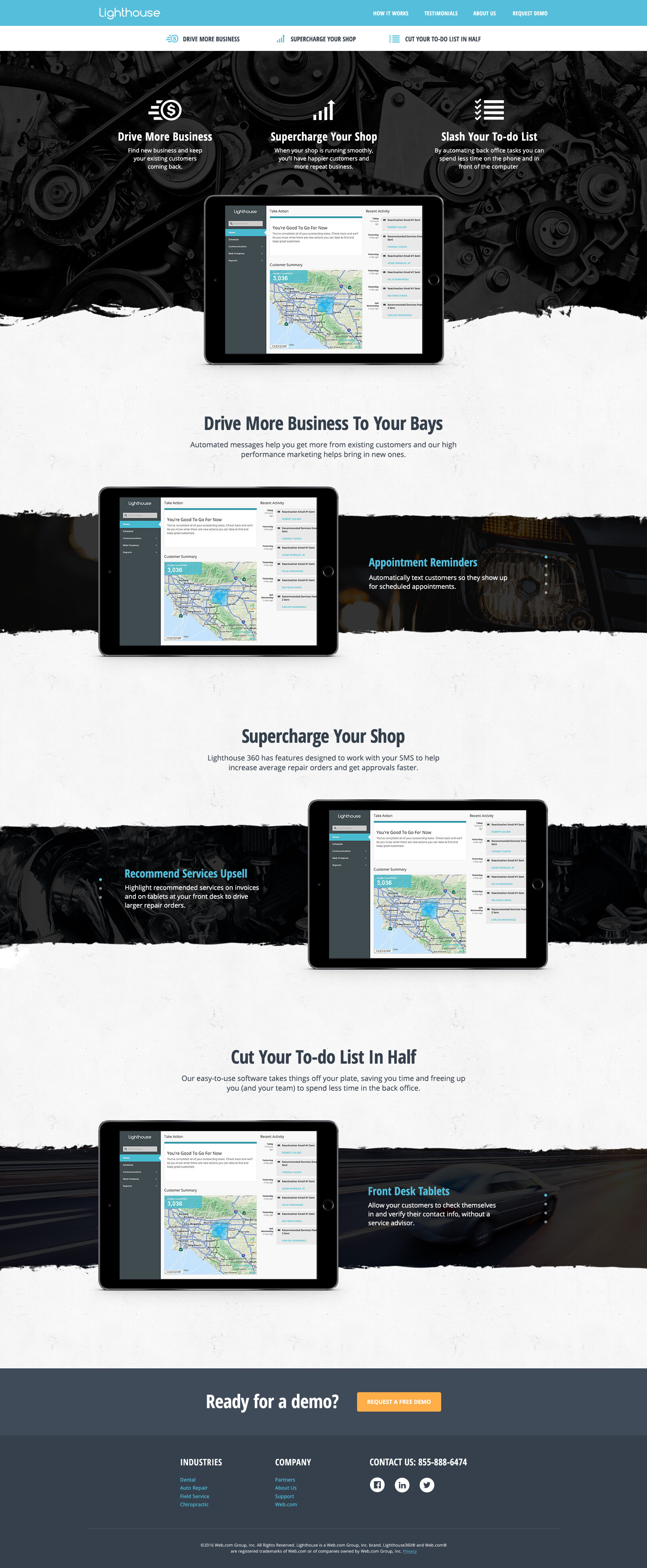
Lighthouse Automotive Site, Old Versus New.
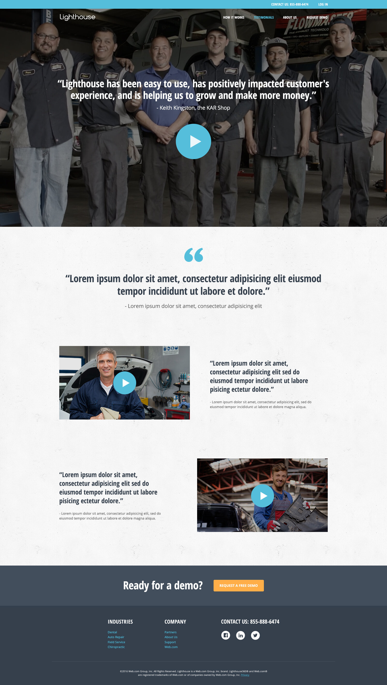
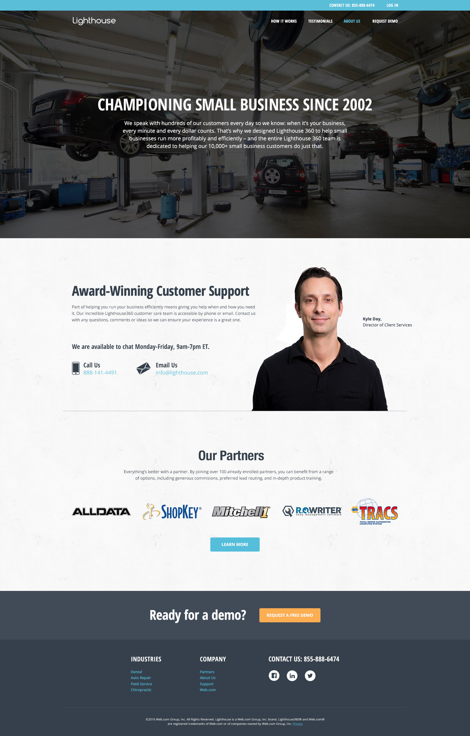
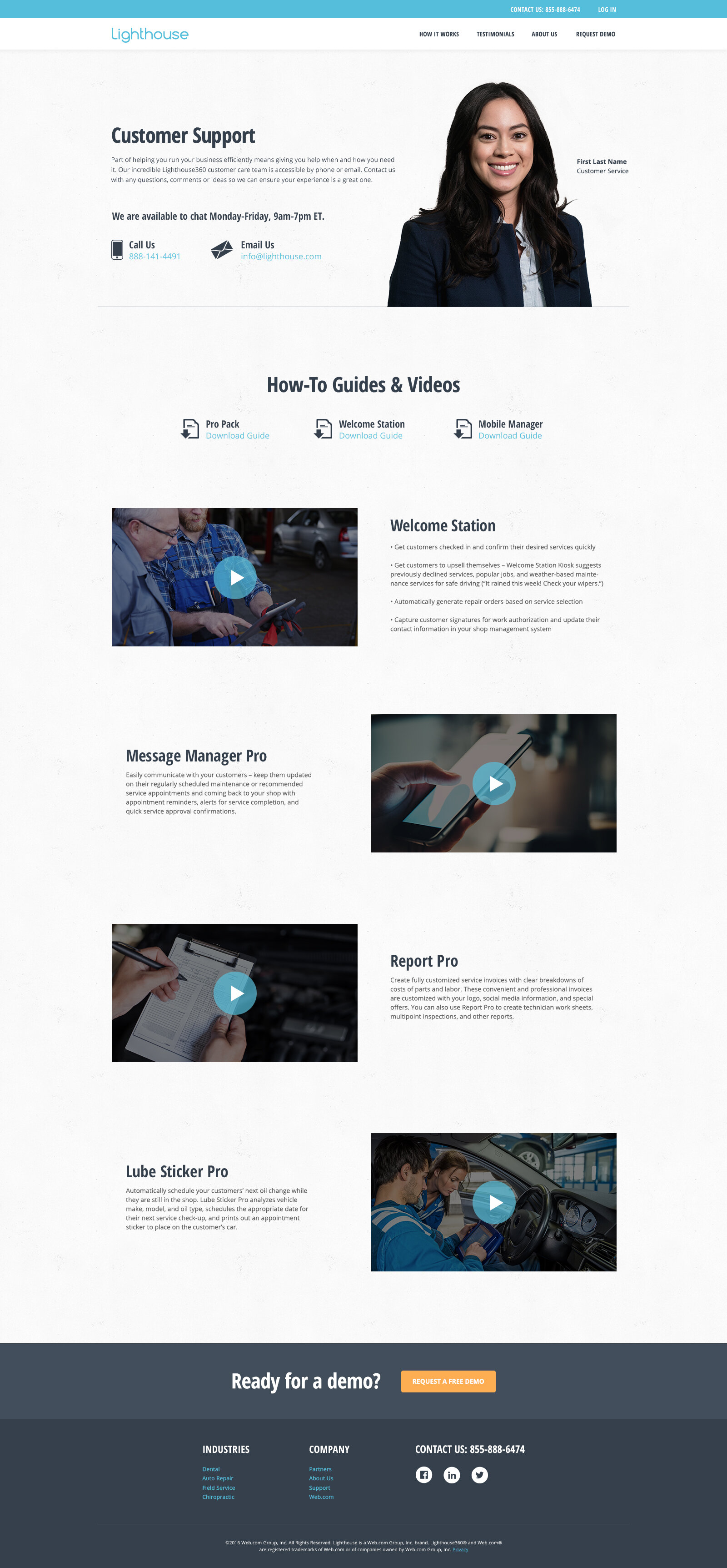
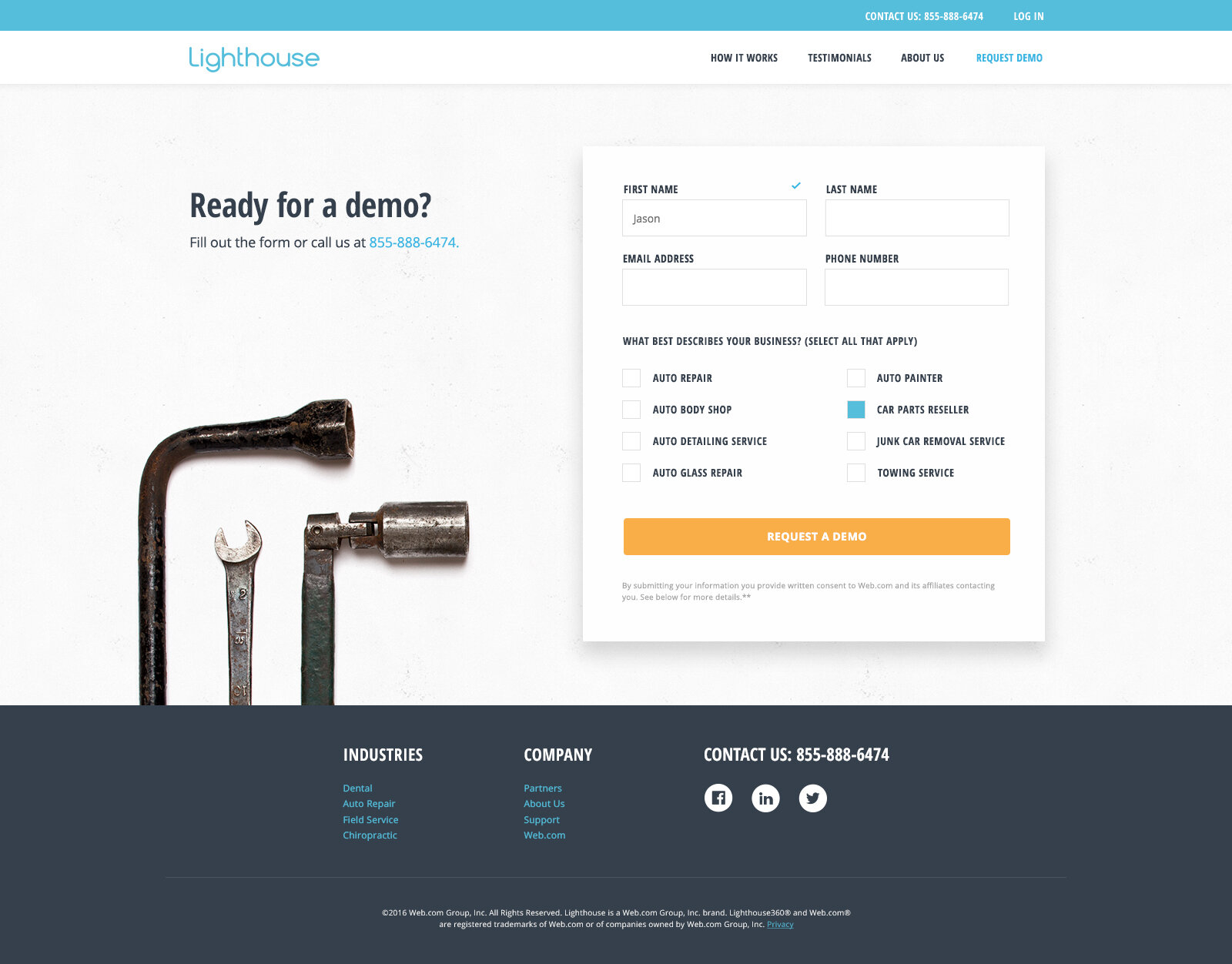
1. Modern responsive design that features textures, tools and videos that reflect repair shops. Additionally, added product shot to showcase this is a software product (this was a key learning and necessary step for a home page with all our testers).
2. Stronger tone of voice with less of a focus on marketing speak and more simplified benefits language.
3. Video case study of how effective the product is and explanation of how it works in a real world situation.
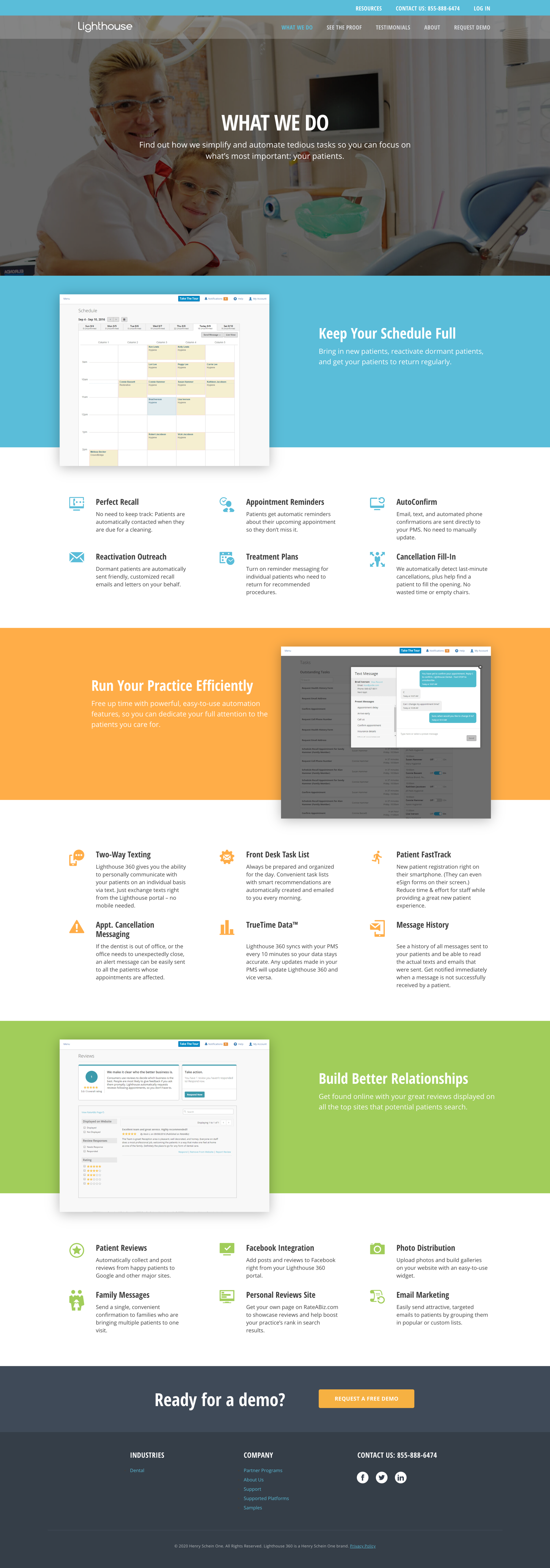
Lighthouse Dental Website
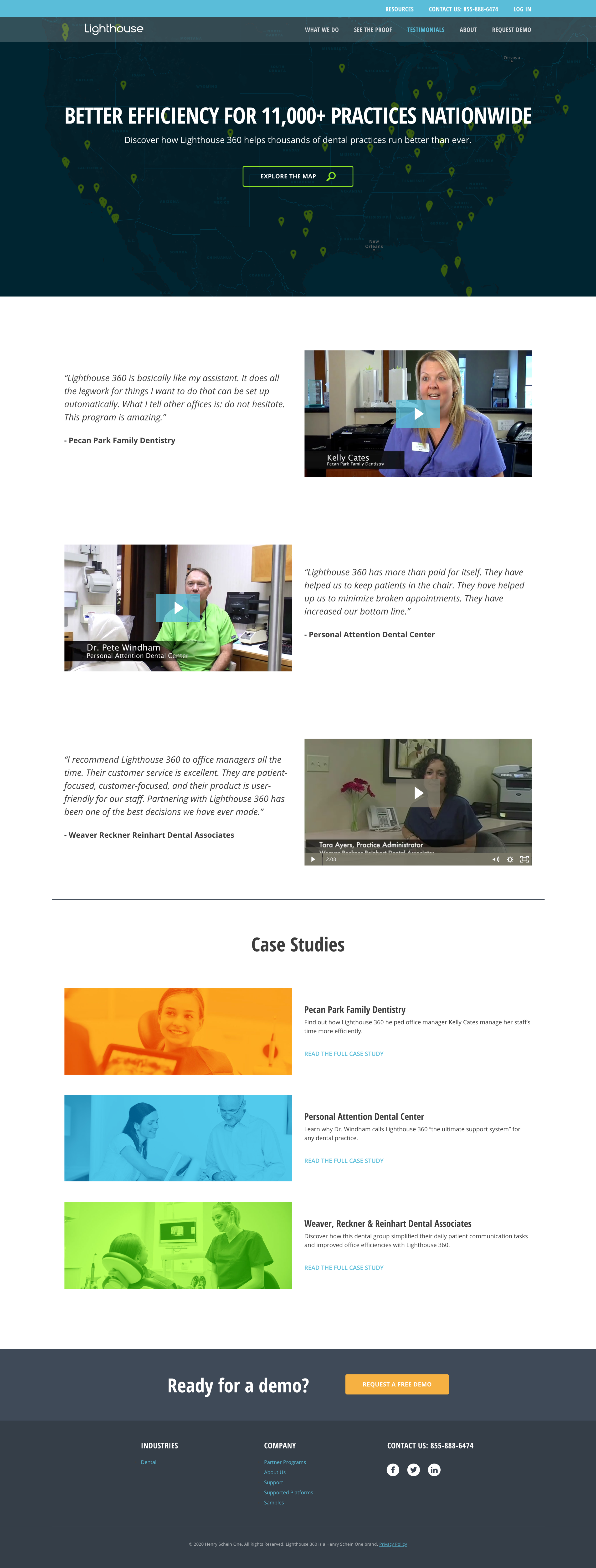
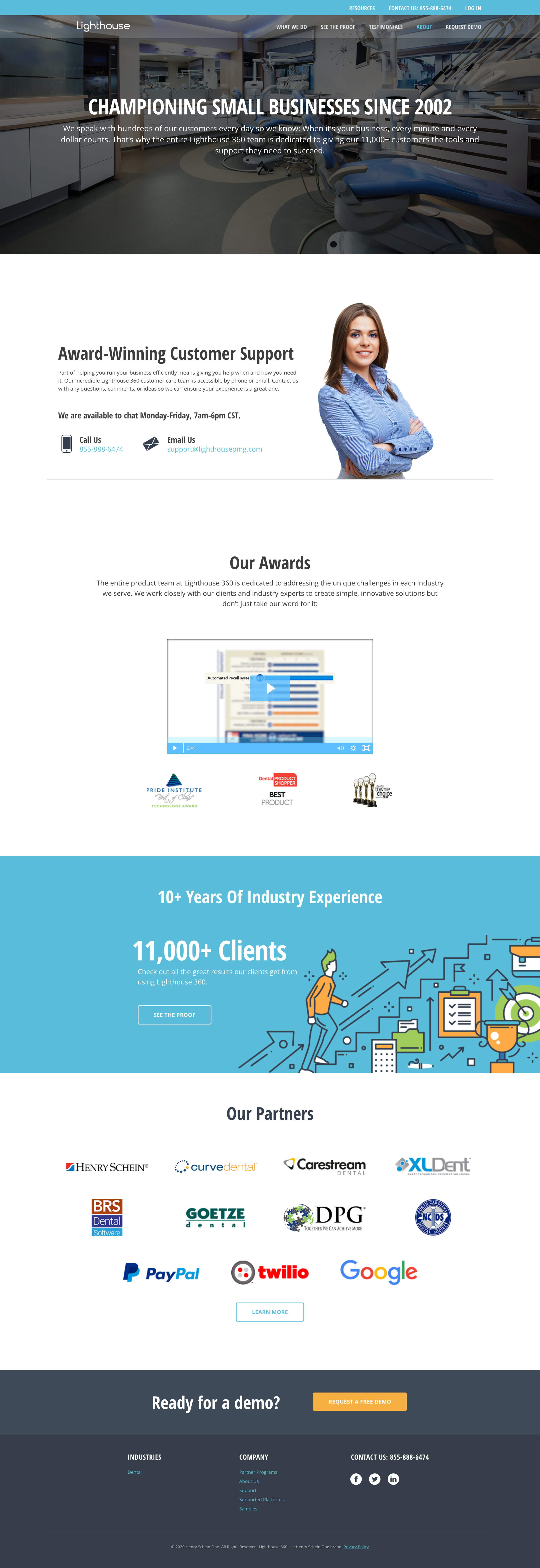
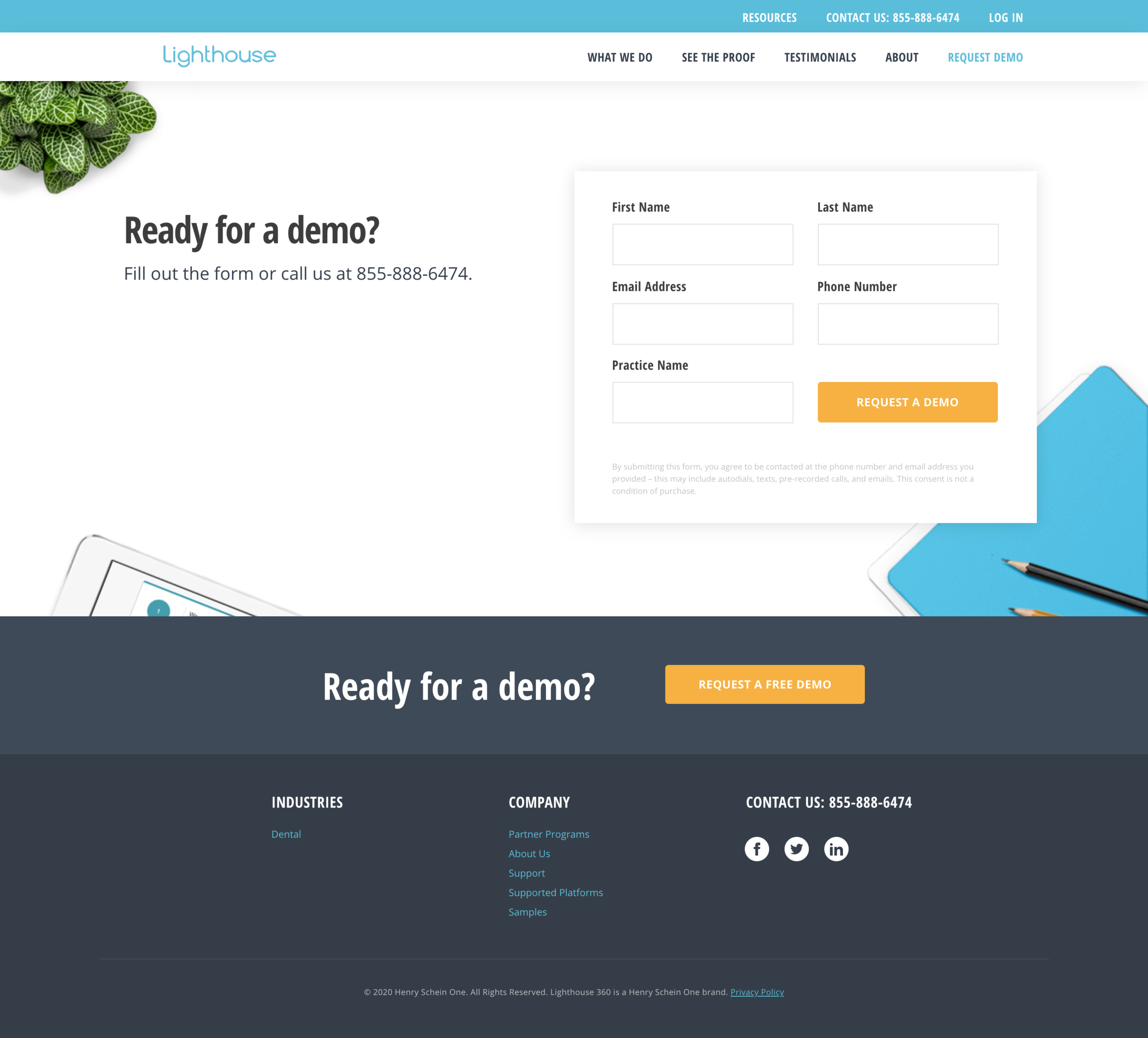
Lighthouse Dental Site, Old Versus New.
1. Modern responsive design that incorporated a sterile look dentists preferred, new features, proof points, partner logos and industry awards which show how well Lighthouse is loved within the dental industry.
2. Stronger tone of voice with less of a focus on marketing speak and language that came directly from our customers.
3. Video case study of how effective the product is and explanation of how it works in a real world situation.
Lighthouse For Field Service Businesses Website
Lighthouse Field Service Old Versus New Site.
1. We streamlined the website which allowed users to better assess the product.
2. We cleaned up the hero with a stronger conversion message, proof points and CTA.
3. The product shots were cleaned up to better show the software at work and animations added to highlight the simplicity.
4. We enhanced the messaging to focus on the key benefits and allowed users to better scan the content. We also removed the marketing speak and provided more results driven messaging.
5. Added a video testimonial to showcase the product and how it works.
